Jodi Lee
Executive Director
Brand guide · version 2 · October 21, 2026
How BIAU looks and sounds, and the rules that keep it that way. Every color, size and component on this page is the real one from the website, so this guide is always current.

01
This guide is for anyone who makes something for BIAU: staff and board members, volunteers designing a flyer, a designer or printer, and anyone (or any AI tool) editing the website.
Big areas are lavender, cream, sky or white. Orange is one button, a dot or a date tile, never a block. Some readers are sensitive to light.
Body text is 17 pixels or larger, with plenty of space between lines. Many readers are tired, in pain or reading on a phone in a parking lot.
Each page has one job and each section offers one clear thing to do, like “Get peer support.” The fewest clicks possible.
Name the piece you want, using the names in chapter 9. “Add a lavender feature card under the steps on the peer support page” works far better than “make it pop.” Ask for a preview, check it on your phone, then publish. The site’s built-in checks stop a change that breaks a link, a color rule or a form.
02
Support. Education. Connection.
Resource facilitation comes first: a resource facilitator helps Utahns with a brain injury find organizations that help with Medicaid applications, housing lists and health care providers. Funded by the State of Utah.
Peer support: trained peer supporters who have been there, for people who want someone to talk to.
Mission. To improve the lives of individuals with brain injury by supporting, educating, inspiring, advocating and engaging a global community.
Vision. A world in which everyone with brain injury has the resources and support they need to thrive.
Tagline. Helping those with brain injuries thrive. (as printed on the 2026 banner).
People find this site at hard moments: in a hospital hallway, at the kitchen table at 2 a.m., or on a phone in a parking lot. Everything here is built for that reader.
Soft rounded shapes, calm lavender, plain words. BIAU sounds like a person who has been there, not an institution.
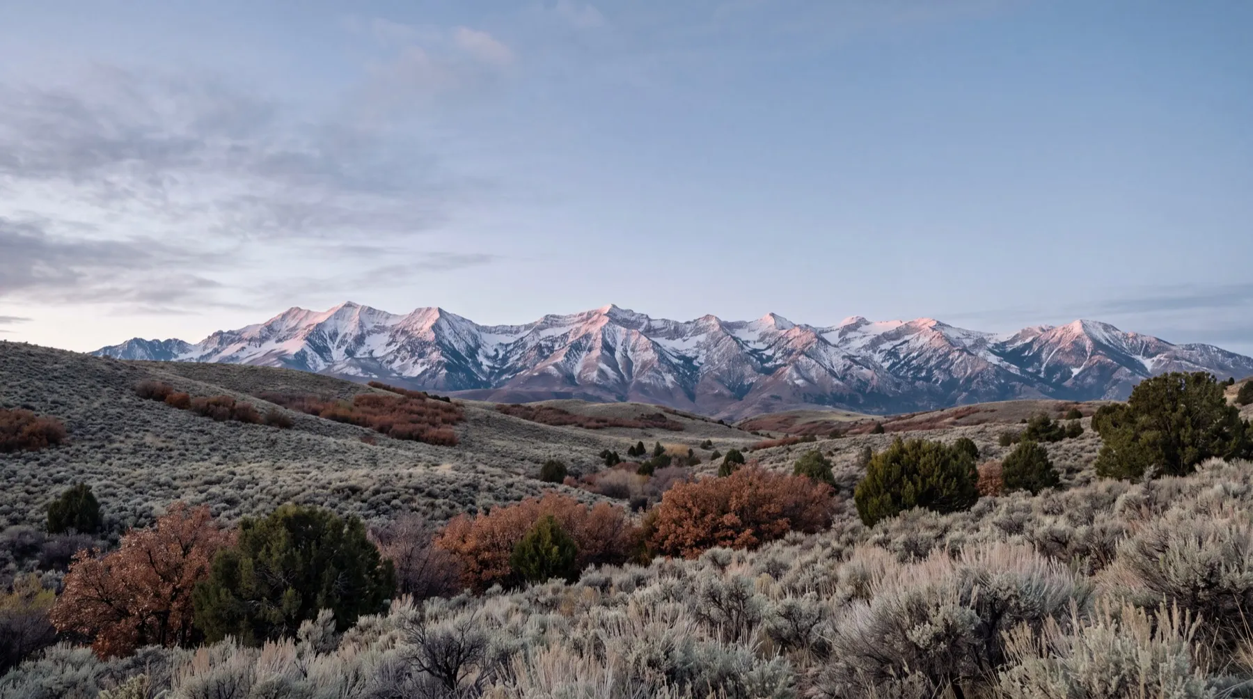
Real Utah places carry the pages: red rock, the Wasatch, the salt flats, a quiet valley road. Help is statewide and close to home.
Large text, short sentences, calm colors, calm motion and one clear next step. Nothing flashes, nothing rushes, nothing hides.
BIAU is
BIAU is not
03
Half a brain in four steps of lavender, from light to indigo, beside the name in condensed capitals on four lines. It is on the new banners and printed pieces, and the board keeps it for at least the next year, so the website is built around it.
Everything else in this guide comes from the logo: the four lavenders are its four bands, the ink is its type, and the capitals in the name are where the site’s few capitals come from.
The artwork here is BIAU’s own file. There is no vector master; these PNGs are the source, sharp to about 1,500 pixels tall, enough for the web and for prints up to about 12 inches. For anything larger, ask the designer who made the banner for their working file.
BIAU’s files hold the name three ways. Capitals is the version on the 2026 banner and the one to use on everything new. The other two exist in older files; never mix two versions on one piece.


In the logo file the name is about a tenth of the logo’s height, so below about 96 pixels it cannot be read. For the website header and anywhere small, the site rebuilds the same lockup: the mark, the rule, and the name in Figtree ExtraBold capitals on the logo’s four lines. Same logo, legible at about 50 pixels.
 BrainBrainBrain
The logo sits on white, cream or surface, and nowhere else. There is no white or one-color version: turned white, the mark becomes a blob and the letters keep a halo from the artwork’s soft shadow. On lavender the top band disappears. So on purple, ink, lavender or a photo, the logo sits inside a white tile.
Keep empty space around the logo at least a quarter of the mark’s height on every side. Nothing else (text, edges, other logos) enters it.
Brain| Mark alone, screen | 24px tall (the browser tab icon is the one exception) |
|---|---|
| Built lockup, screen | 40px tall |
| Logo artwork, screen | 96px tall |
| Logo artwork, print | 1 inch / 25 mm tall |
| White tile around it | At least 16px of white on every side |
Brain04
Lavender leads. White carries the page, ink carries the words, and the logo’s own four steps of lavender do the rest. Cream and sky support. Orange is a dot.
On lavender, cream, sky and orange, text is ink. White text goes only on purple, on ink and on the dark part of a photo. Nothing is written on deep lavender. These pairs are checked by the site’s build on every change:
| Color | Job | Where you see it |
|---|---|---|
| Lavender | Support | Get help, peer support pages, the give band, most page headers |
| Deep lavender | Decoration | The footer waves, eyebrow dots, the rule in the lockup, icon rings |
| Purple | Dark grounds | The footer, the quote card, at most one band per page |
| Sky | Learning | Learn and every guide |
| Cream | BIAU itself | About, News, Events, Donate, Support us, Contact, the steps card |
| Orange | The accent | One accent button per screen, a dot, a date tile |
05
One typeface, Figtree, at every size, so the whole site reads in one friendly voice. It is open and round, with clear letter shapes that stay readable on a phone in bad light. Free under the Open Font License; the site serves its own copy, and it is in Google Docs and Canva too.
Weights: Regular 400 for reading, SemiBold 600 for UI, Bold 700 for headings, ExtraBold 800 for page titles, the hero and capitals. Fallback where Figtree is missing: Arial.
The condensed capitals in the logo belong to the logo artwork. The site never sets text in that face, and the brush script on the banner stays in print.
The logo’s name is in capitals, so the site uses capitals too, in three places and nowhere else. Readers at a third to fifth grade level recognize words by their shape, and capitals flatten that shape, so a sentence in capitals is slower for exactly the people this site serves.
The lockup name
BrainFour lines, as in the logo.
Labels and eyebrows
Peer support
14px, spaced, two or three words.
One big word
The banner’s pattern: a small line, then one word.
06
Content sits in a column up to 1,180px wide, with side margins from 16px on phones to 40px on laptops. Sections stack as one, two or three columns and collapse to one on phones. Reading pages keep text to 68 characters a line.
Every gap comes from one scale. Sections are separated by 56 to 96px.
Everything is rounded, nothing is sharp. Separation comes from color and space, not shadows or borders. The one soft curve is the wave above the footer, taken from the banner.
Motion is calm, short and happens once. Sections rise 14 pixels and fade in as the reader reaches them, and cards in a row follow each other 70 milliseconds apart. The example conversations play like a real chat, with typing dots before each reply. Steps slide in and their numbers pop. In the header, the logo fades in a breath after the page.
Buttons and cards lift 2 to 4 pixels on hover and press in slightly when tapped. Forms say “Sending…” while they send. Nothing loops, flashes or moves after it settles, and photos never zoom. When a visitor’s device asks for reduced motion, or JavaScript is off, every page is still and fully visible.
Example conversation.
| Kind | Time | Easing | Used for |
|---|---|---|---|
| Arrive | 560ms | cubic-bezier(.16, 1, .3, 1) | Sections, cards and photos as they scroll in |
| Respond | 150 to 250ms | cubic-bezier(.2, 0, 0, 1) | Hover, press, tabs, the questions list |
| Pop | 420ms | cubic-bezier(.34, 1.56, .64, 1) | Step numbers only |
Add motion to a new piece with data-reveal (rise), data-reveal="fade", data-reveal="wipe" (photos) or data-reveal-stagger (a row of cards). The rules live in src/styles/motion.css.
07
Real Utah, and real people only with their permission. Photos should feel like a deep breath, not a diagnosis.



Show
Avoid
08
Rounded line icons drawn on a 48-unit grid with a 3-unit stroke, round ends and no fills. Ink on white tiles. Always next to words: an icon never carries meaning alone. 24px inline, 34px in a card tile. On printed pieces, the contact icons sit in a thin deep-lavender ring, as on the banner.
09
The building blocks of every page. Use these names when you ask for a change.
One shape: a pill. Primary (ink) for the main action. Accent (orange, ink text) for the single most important action on a photo or a white page, at most once per screen. Soft for second choices. White on color and on purple. Glass only on the dark part of a photo. Labels say what happens: “Get peer support,” not “Submit.”
Links are ink and underlined. Arrow links end a card. Eyebrows sit above a heading with a deep-lavender dot. Pills tag who something is for.
Read brain injury basics first. All guides
Peer support
Big tappable cards in lavender, sky or cream, with an icon tile, a short title, one sentence and an arrow link. The whole card is the link. Use on the homepage and hub pages, in a row of two or three. The two doors into peer support are two color cards: “Get peer support” and “Be a peer supporter.” Use the prominent variant for these opening choices: larger cards, 19px body text and a full-width dark button at least 64px tall with 20px text. The whole card is one link and one keyboard stop. Keep the choices visible without entrance animation or hover movement.
Talk with a peer supporter who has lived something close to what you’re living.
Ask for a peer supporterLived with a brain injury, or cared for someone who has? Your experience can help.
Apply to be a peer supporterShort, plain guides on what a brain injury is and what recovery can look like.
Brain injury basicsA large two-column lavender, sky or cream block: a visual on one side, a heading, one paragraph and one or two buttons on the other. Resource help leads the homepage in one of these.
A resource facilitator connects you with organizations and services that fit your needs. Email or call us to get started.
“What are you looking for today?” Pill tabs that switch one big card; each tab carries its color. Arrow keys move between tabs.
Example conversation.
Small white pieces that sit inside color blocks. A link stack points at two to four guides. An info list holds a schedule or key facts. A conversation shows what peer support sounds like, labeled as an example unless the words are a real member’s.
Example only.
Example conversation.
Every interior page opens with a rounded card in its section’s color: breadcrumb, title, one sentence. Lavender for support, sky for learning, cream for BIAU, surface for legal pages. Peer intake pages use a compact header with a large 64px button linking directly to the form. Keep that header still and visible from the start. The Donate page also keeps its header and choices still, with a full-width, 64px “Donate online” button that opens PayPal’s secure checkout.
What a brain injury is, in plain English.
The photo hero opens the homepage (display type) or a page that leads with a place. The photo band holds one strong statement over a dimmed photo. White text only, on the dark part.
A cream card for a real sequence of three to five steps. If the order does not matter, use a list instead.
Four steps from hello to your first conversation.
The quote card is ink with the words in lavender; real quotes only, with written permission, credited by role and place. The give band is lavender with ink text and one primary button, once per page at most.
“Two years in, I'm still finding new ways to do old things.”
The Brain Injury Alliance of Utah is a nonprofit organization. Your gift supports resource help, peer support, education and connection for Utahns living with brain injury and the people who care for them.
The banner’s bottom, on the web. Three soft waves, light lavender to purple, lead into the footer: a purple ground with the logo on a white tile, the links, the contact details and the tagline with its one big word. The wave appears once per page, above the footer or above one purple band.
Helping those with brain injuries
A questions list opens one answer at a time and works without JavaScript. A person card introduces a board or staff member; a real photo only, initials otherwise.
Anyone in Utah living with a brain injury, and anyone caring for someone who is.
Answer to be confirmed with BIAU.
Executive Director
Labels above fields, always visible. Hints in muted text. Optional fields say “optional”; everything else is required. Errors say what went wrong and how to fix it, in words. Ask only for what BIAU will use, and never for medical records. Use BIAU’s supplied questions for each peer form. Long forms go in short steps with one clear step count and a Back button; without JavaScript every step shows. Peer forms use 17px labels, 48px answer rows and 64px Continue, Back and Send buttons. Support requests and supporter applications use separate Google Forms.
On the preview, details only BIAU can supply show like this: [program coordinator’s name]. The site will not launch while any remain.
10
BIAU speaks as “we” and talks to “you,” like a friend who has been there and knows the way.
Short sentences, about 12 words. Everyday words. Third to fifth grade reading level, because tired and injured brains read too. One task per page.
Lead with what the reader is feeling, then what to do. Never blame, never rush, never guilt.
Recovery is different for everyone. Say what BIAU offers, not what it cannot promise. Medical questions go to the reader’s care team.
Set with Jodi Lee and Dr. Christine Mullen at the kickoff on October 21, 2026.
| Say | Instead of | Why |
|---|---|---|
| peer supporter | mentor, buddy, volunteer | The word in the grant that funds the program. Named the same everywhere. |
| get peer support · be a peer supporter | mentee and mentor, request and apply | The two doors into peer support, in the reader’s words. |
| sustained a brain injury | suffered a brain injury | “Suffered” tells people they are suffering. “Sustained” just says what happened. |
| people living with a brain injury | survivors, victims, the brain-injured | Person first. “Survivor” only when a person or group uses it for themselves. |
| lives with, has | suffers from, is afflicted by | Describes without pity. |
| brain injury | TBI, ABI (unexplained) | Spell it out. Explain “traumatic brain injury” where it matters. |
| caregiver, family | carer, burden | The words Utah families use. |
| can, may, often | will, always, cure | No promises about recovery. |
Before
“BIAU facilitates peer-to-peer mentorship connections for individuals impacted by acquired and traumatic brain injuries.”
After
“We match you with a peer supporter: someone who has lived with a brain injury, or cared for someone who has.”
11
The site meets WCAG 2.2 AA, and goes further where brain injury makes reading harder: fatigue, memory, attention and light sensitivity.
12
| Page | Header | Part of the site |
|---|---|---|
| Home | Photo hero | Resource help first, then Get peer support / Be a peer supporter |
| Get help | Lavender | Support: resource facilitation, groups, caregivers |
| Peer support, Get peer support, Be a peer supporter | Lavender | Support |
| Learn and every guide | Sky | Learning |
| About, News, Events, Support us, Donate, Contact | Cream | BIAU |
| Privacy, Terms, Accessibility | Surface | Legal |
13
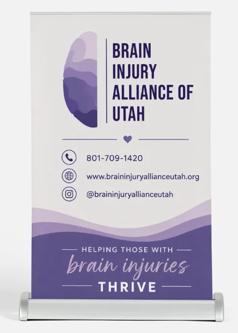
The 2026 banner is the reference for everything printed. New pieces follow it; the website follows them.
14
BIAU has no vector master (SVG, AI or EPS) of the logo; the designer who made the 2026 banner may have one.